Automating Digital Underwriting with Machine Learning
Leverage Machine Learning with real-time data processing and automate digital underwriting.
Industries: Insurance, Financial Services, Healthcare
Products and tools: Time Series, Atlas Charts, Spark Connector
Partners: Databricks
Solution Overview
Imagine being able to offer your customers personalized, usage-based premiums that take into account their driving habits and behavior. To do this, you'll need to gather data from connected vehicles, send it to a machine learning platform for analysis, and then use the results to create a personalized premium for your customers. You’ll also want to visualize the data to identify trends and gain insights. This unique, tailored approach will give your customers greater control over their insurance costs while helping you to provide more accurate and fair pricing.
In the GitHub repo, you will find detailed, step-by-step instructions on how to build the data upload and transformation pipeline leveraging MongoDB Atlas platform features, as well as how to generate, send, and process events to and from Databricks.
By the end of this demo, you’ll have created a data visualization with Atlas Charts that tracks the changes of automated insurance premiums in near real-time:
Other Applicable Industries and Use Cases
Financial Services: Banks and financial institutions must be able to make sense of time-stamped financial transactions for trading, fraud detection, and more.
Retail: Real-time insights into what’s going on right now.
Healthcare: From the modes of transportation to the packages themselves, IoT sensors enable supply chain optimization while in-transit and on-site.
Reference Architecture

Figure 1. Reference Architecture With MongoDB
Data Model Approach
A basic example data model to support this use case would include customers, the trips they take, the policies they purchase, and the vehicles insured by those policies.
This example builds out three MongoDB collections, as well two materialized views. The full Hackloade data model which defines all the MongoDB objects within this example can be found on GitHub,.
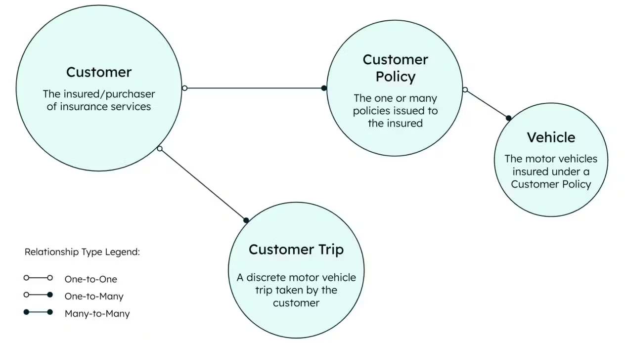
Figure 2. MongoDB Data model approach
Building the Solution
A dataset including the total distance driven in car journeys is loaded into MongoDB and a daily cron job is run every day at midnight that summarizes the daily trips and compiles them into a document stored in a new collection called “CustomerTripDaily.” A monthly cron job is run on the 25th day of each month, aggregating the daily documents and creating a new collection called “Customer Trip Monthly.” Every time a new monthly summary is created, an Atlas function posts the total distance for the month and baseline premium to Databricks for ML prediction. The ML prediction is then sent back to MongoDB and added to the “Customer Trip Monthly” document. As a final step, you can visualize all of your data with MongoDB Charts.
Creating a Data Processing Pipeline with a Materialized View
The data processing pipeline component of this example consists of sample data, a daily materialized view, and a monthly materialized view. A sample dataset of IoT vehicle telemetry data represents the motor vehicle trips taken by customers. It’s loaded into the collection named ‘customerTripRaw’ (1). The dataset can be found on GitHub and can be loaded via MongoImport or other methods. To create a materialized view, a scheduled trigger executes a function that runs an aggregation pipeline. This then generates a daily summary of the raw IoT data and places it in a materialized view collection named ‘customerTripDaily’ (2). Similarly for a monthly materialized view, a scheduled trigger executes a function that runs an aggregation pipeline that summarizes the information in the ‘customerTripDaily’ collection on a monthly basis and places it in a materialized view collection named ‘customerTripMonthly’ (3).
See the following Github repos to create the data processing pipeline:
Step 1 Load the sample data
Step 2 Setup a daily cron job
Step 3 Setup a monthly cron job

Figure 3. Creating a data processing pipeline
Automating Insurance Premium Calculations with a Machine Learning Model
The decision-processing component of this example consists of a scheduled trigger that collects the necessary data and posts the payload to a Databricks ML Flow API endpoint. (The model was previously trained using the MongoDB Spark Connector on Databricks.) It then waits for the model to respond with a calculated premium based on the miles driven by a given customer in a month. Then the scheduled trigger updates the ‘customerPolicy’ collection to append a new monthly premium calculation as a new subdocument within the ‘monthlyPremium’ array.
See the following Github repos to create the data processing pipeline:

Figure 4: Automating Calculations with Machine Learning Model
Near-Real-Time Insights of Insurance Premium Changes over Time
Once the monthly premium calculations have been appended, it’s easy to set up Atlas Charts to visualize your newly calculated usage-based premiums. Configure different charts to see how premiums have changed over time to discover patterns.
Technologies and Products Used
MongoDB Developer Data Platform
Partner Technologies
Key Considerations
Building materialized view on time series data: refer to steps 1-3 in the GitHub repo.
Leveraging aggregation pipelines for cron expressions : refer to steps 2 or 3 in the GitHub repo.
Serving machine learning models with MongoDB Atlas data: refer to step 4 in the GitHub repo.
Writing a machine learning model prediction to an Atlas database: refer to step in the GitHub repo.
Visualizing near-real-time insights of continuously changing model results: refer to the Bonus step in the GitHub repo.
Author
Jeff Needham, MongoDB
Ainhoa Múgica, MongoDB
Luca Napoli, MongoDB
Karolina Ruiz Rogelj, MongoDB